Brief:
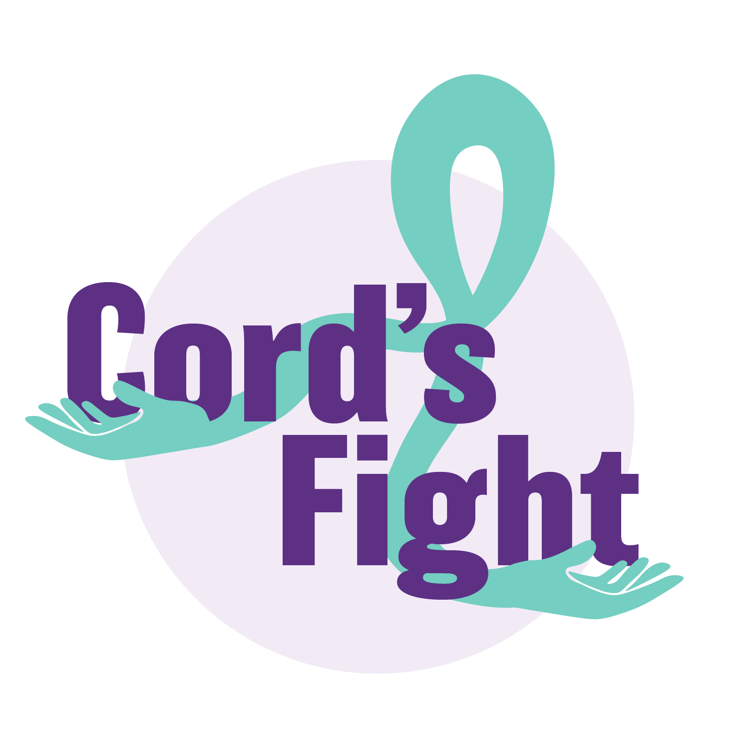
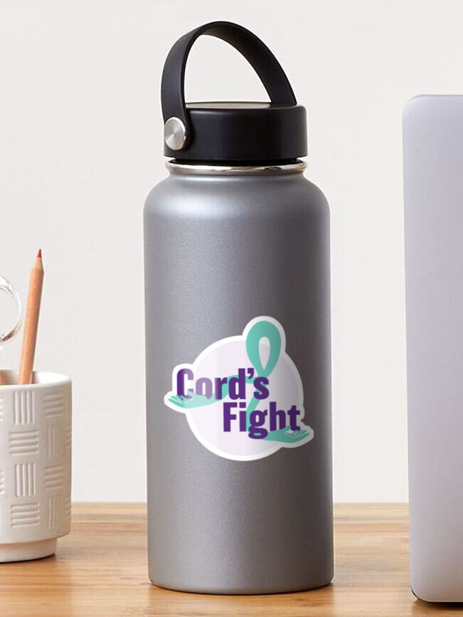
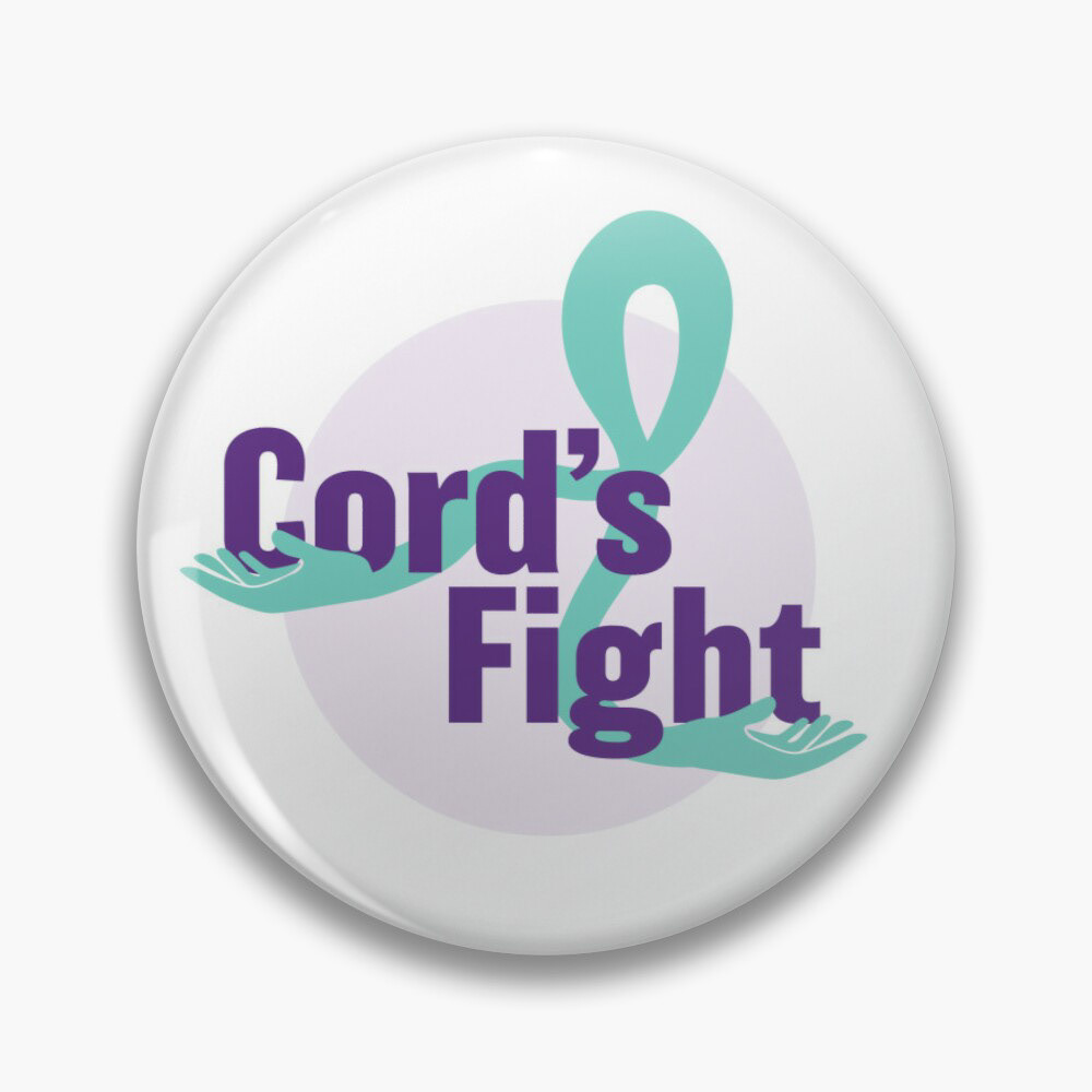
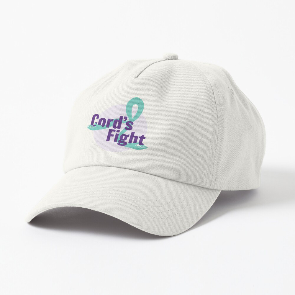
Cordus Pearce’s family wished for designers to provide a new logo and style in remembrance of Cord’s spirit. Doing so, provided me the opportunity to help to connect design with representations and real-life stories in my community. Cord’s family was very excited to receive a new design that captured his identity and story. For this project, a central theme was Suicide Awareness and how to demonstrate the power that comes with that alongside the battle that Cord had experienced. His family provided “Cord’s Fight” as the title and the focal point for this design process.
Process:
I decided to use the color palette of the classic turquoise and purple ribbon that symbolizes Suicide Awareness. With that in mind, I believed that a strong logo would not only incorporate those colors but would have some sort of reference to the ribbon. After attempting to create the logo several times, I designed a ribbon that would with the symbolism of embracing. I did that by adding hands to both ends of the ribbon, implying that it is holding “Cord’s Fight”, as in, providing this fight with a space it can rely on. I also wanted the words to hold power on their own which influenced the font choice– bold and powerful.