Brief:
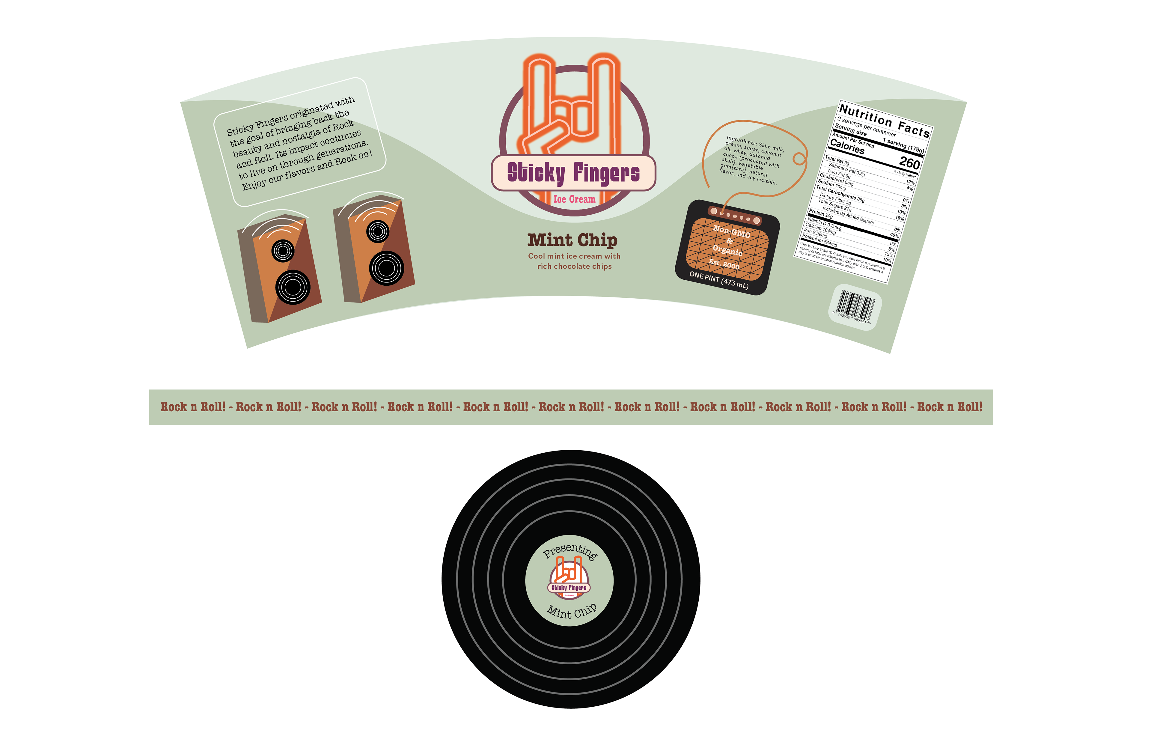
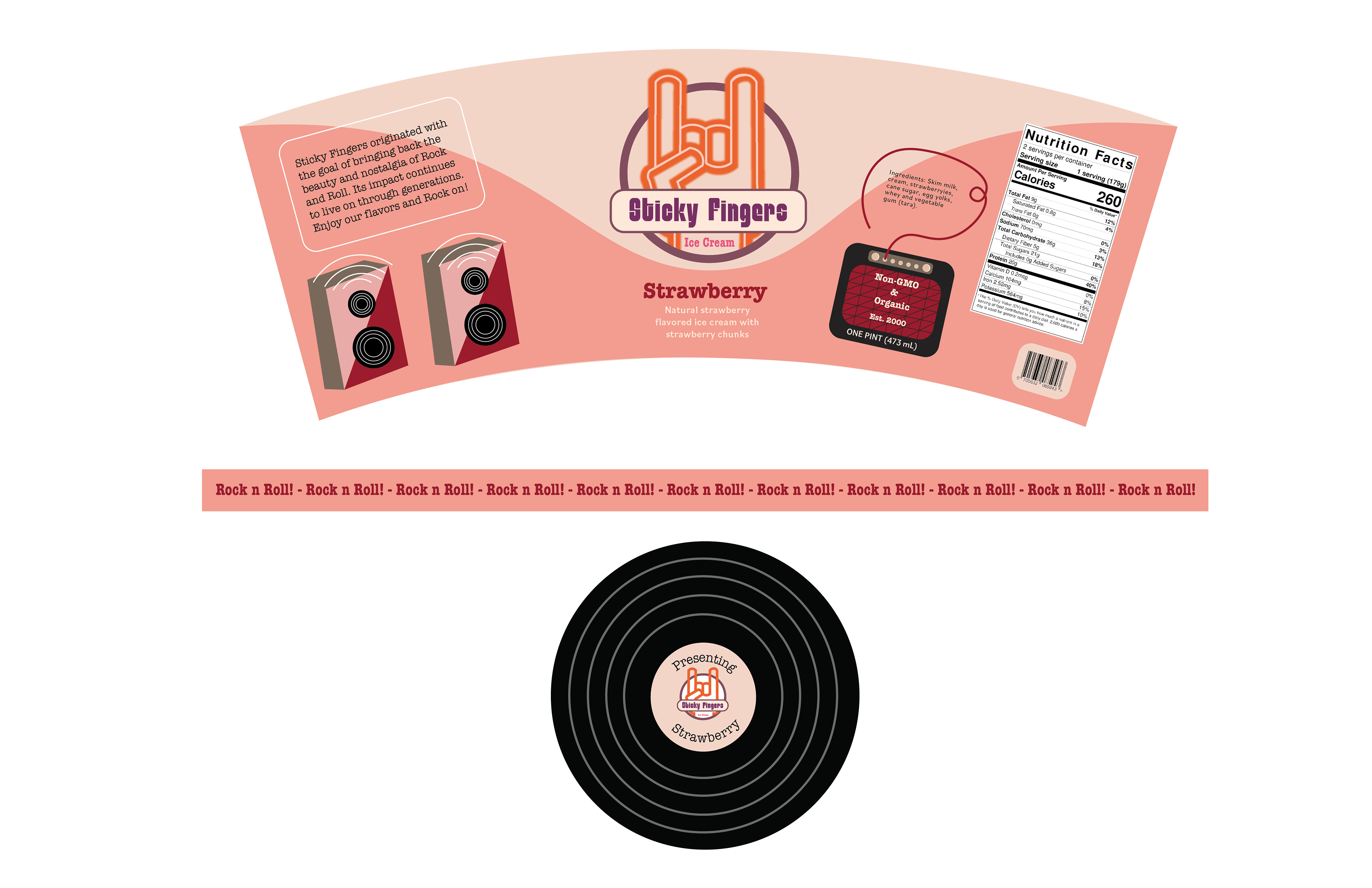
For this project, I created a story for a new ice cream company by designing their pint containers. I formed a packaging system by designing a logo and picking three different flavors all of which relate to each other in terms of style and concept. The creative process began with creating a nostalgic rock music theme that included specific details relating to retro and rock and roll styles. The process specifically included the creation of a consistent logo, a detailed band that wraps around the container, and a lid design. The color palettes vary depending on the different ice cream flavors.
Concept:
I decided to title the work Sticky Fingers in reference to the famous rock band, The Rolling Stones. This name addressed both the rock and roll theme that this brand intends to carry and playfulness with ice cream being messy when it is being enjoyed. The illustrations across the magazine further emphasize the music aspect with the speakers and amp that are displayed. Overall, the color palette for each individual container is influenced according to the specific flavor.